CGI RENDERINGS
River Film and CGIs
One might argue that River Film should really be called River Film AND CGI Renderings because what started out as a little architectural visualisation on the side has grown into a significant part of our business and we create a countless number of still images each year for clients all over the world.
Hopefully the quality of our work speaks for itself, but if you are interested in knowing more about our approach – particularly about how and why we constantly strive to be creative – please read on.
Click to view full render
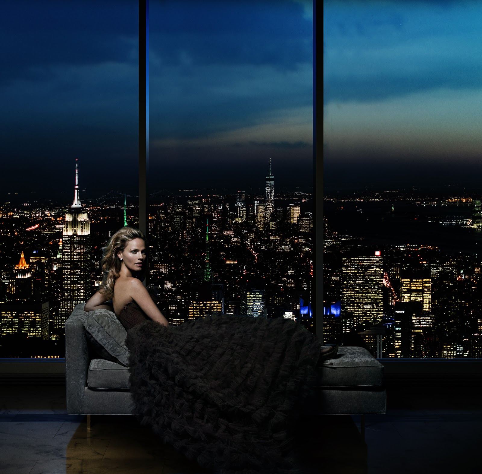
A chaise longue with a view, Central Park Tower, Manhattan.
What are CGI renderings?
Before we go into our approach to CGI renderings, we should probably illustrate exactly what they are, for those who don’t know…
CGI renderings, in real estate anyway, are pieces of architectural visualisation, the original purpose of which was to help an architect show their client what a building is going to look like, but that are now used extensively in marketing.
We generally take basic plans or models from architects (usually Rhino or Revit), convert them into 3D Studio Max, model the geometry in detail, texture, light and render it, and finally finish the image in Photoshop. You’ll then see our CGI renderings printed at very high quality in brochures or on billboards as well as on websites or in digital presentations.
Click to view full render
Click to view full render
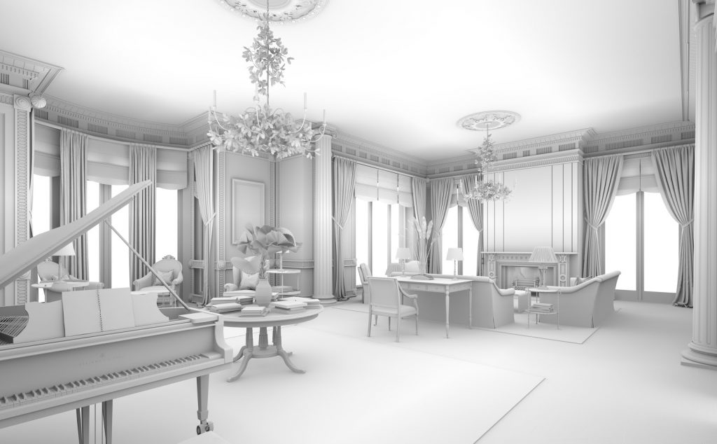
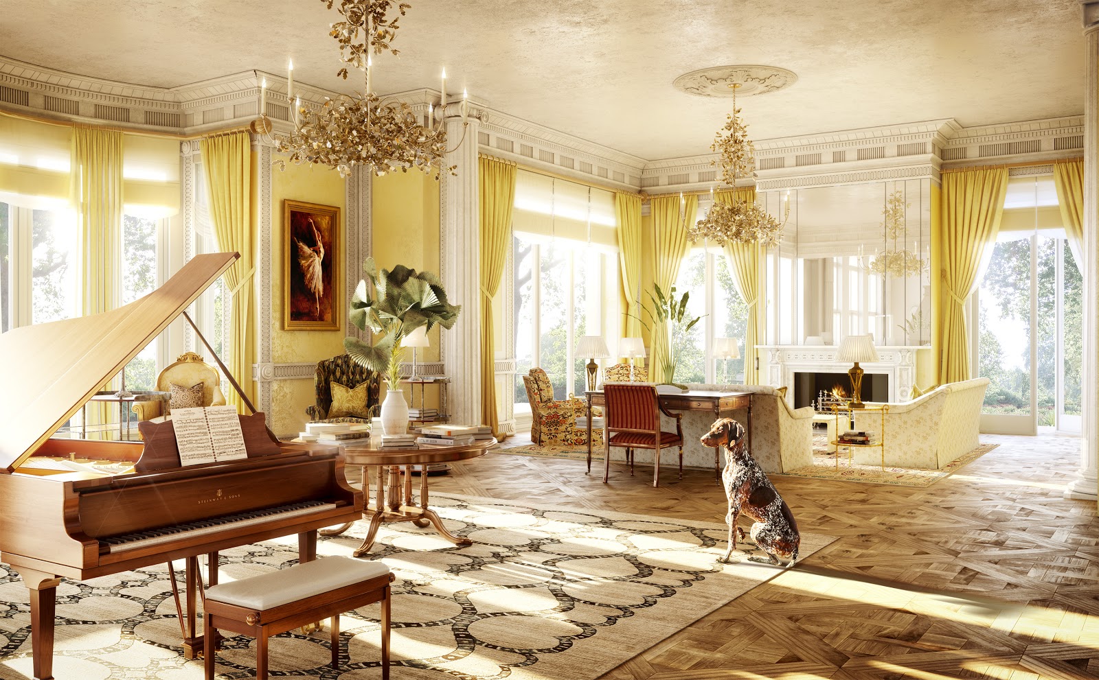
Before and after… It doesn’t take much to create a sense of story – a dog and an open french window do the trick in this case. Romany House, Surrey.
Why be creative when it comes to CGI renderings?
We need to create images, that, like our films, are culturally dynamic and connect message and audience. This is because we need to affect change in our audiences’ perceptions, and our audiences (and their priorities e.g. Wellness) have changed. Therefore, images need to be truly emotive – for that you need to have an idea.

Then and now… Maybe we exaggerate for effect a little? However, certainly in commercial real estate, audiences have changed dramatically over the last ten years!
Click image to view full render
Our creative approach
Our creative approach is clear: we want our CGI renderings to look like stills taken from movies.
What does this mean in practice? Well it’s really simple – everything we do needs to have an idea behind it and a sense of narrative. Now this sounds bleedingly obvious, but it’s a sad fact that there’s been precious little creativity in CGI renderings historically and this remains the case today.
Even the term, “Architectural Visualisation” feels wrong today – our mission isn’t simply to visualise architecture, it’s to portray a lifestyle whether that be in an apartment or in an office.
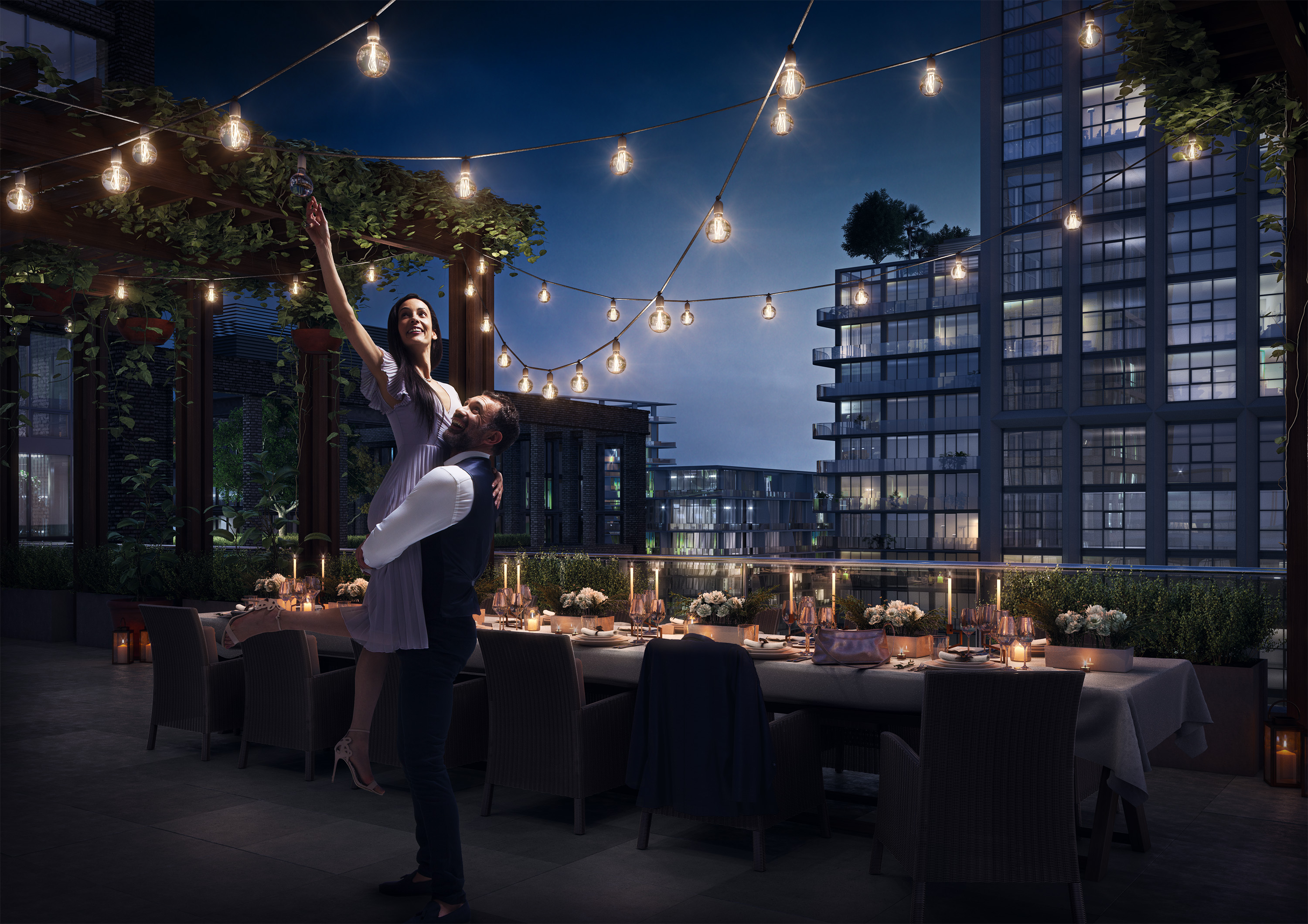
It all starts with an idea… Well that’s what we think anyway! Water Street, Tampa.
What is, “The Creative”?
First of all, let’s define what “The Creative” actually is. Well we know it all starts with an idea, but how do we illustrate that idea in a CGI rendering?
At River Film, we treat each image as though it were a scene from a movie, so we work in the same way:
Direction
Storytelling. Casting. Character development. Performance.
Production Design
Look and feel. Interior design. Styling.
Cinematography
Framing. Lighting.
What makes a great image?
The quality of a rendering is often judged purely on its aesthetics and technical prowess. Whilst we absolutely agree that an image needs to look gorgeous, dramatic and photorealistic, we argue that this is simply not enough.

Click to view full render
Click to view full render
Our CGI rendering workflow
Agree strategic intent
It’s all too easy for a project simply to start without clear strategic goals and without all stakeholders being properly aligned – client, creative agency, agents or brokers and architects might all have different objectives. Understandably, an architect’s priority will usually be to make their building, and any special design features, look as beautiful as possible. The creative agency will want to ensure that the its branding is reflected somehow in the CGI renderings. The client might be focused on how the building sits in the context of their competition’s developments. The agents or brokers will have their own ideas about what is important and what they need to do deals.
Therefore, agreeing strategic intent, and understanding what success looks like, is vital. Then a provisional shot list can be drawn up.
Define message and audience
This flows naturally from the strategic intent – especially if we approach it from a culturally dynamic standpoint. Agreeing what we are trying to say, and to whom, will help us to stay focused on what’s important and not get bogged down in what are ultimately not very relevant or important details.
Come up with an idea
We will always seek to come up with ideas that hit the agreed strategic intent of all stakeholders. We work with clients and creative agencies to figure out what the brand looks like in a CGI rendering as opposed to in a different deliverable.
An image will never sit in isolation and must sit comfortably within all the collateral – it has to support the brand.
Production
We go through an extensive candidate view study to set up the most successful frames for each image in which we explore lenses and angles as well as a first pass of the lighting.
From there we move on to detailed modelling, texturing, lighting and compositing – as well as any required photography be it for back plates in which to sit our building or for views from within. World-class renderings generally require world-class photography and fully computer-generated backgrounds or heavily reworked photography (e.g. turning a snowy winter landscape into a mid-summer one) will usually not be sufficient.
People
To be emotive, you need to tell a story and, very often, a story needs characters.
One of the reasons clients often avoid having people in their CGI renderings is that they’ve just not seen them “done” terribly well before. We pride ourselves in “doing people” to a truly world-class standard.
This doesn’t just mean compositing (cutting them out and placing them in the CGI rendering) properly, it means ensuring that they’re characters rather than mannequins. Who are they? What are they doing? Why?
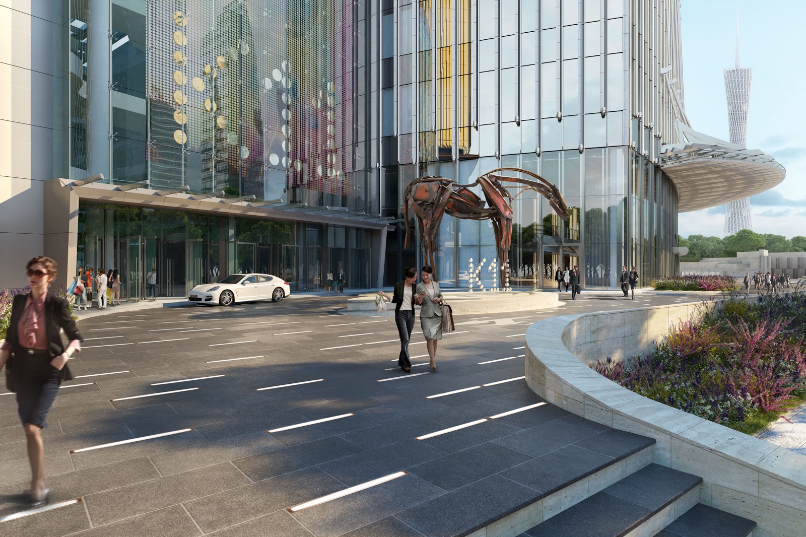
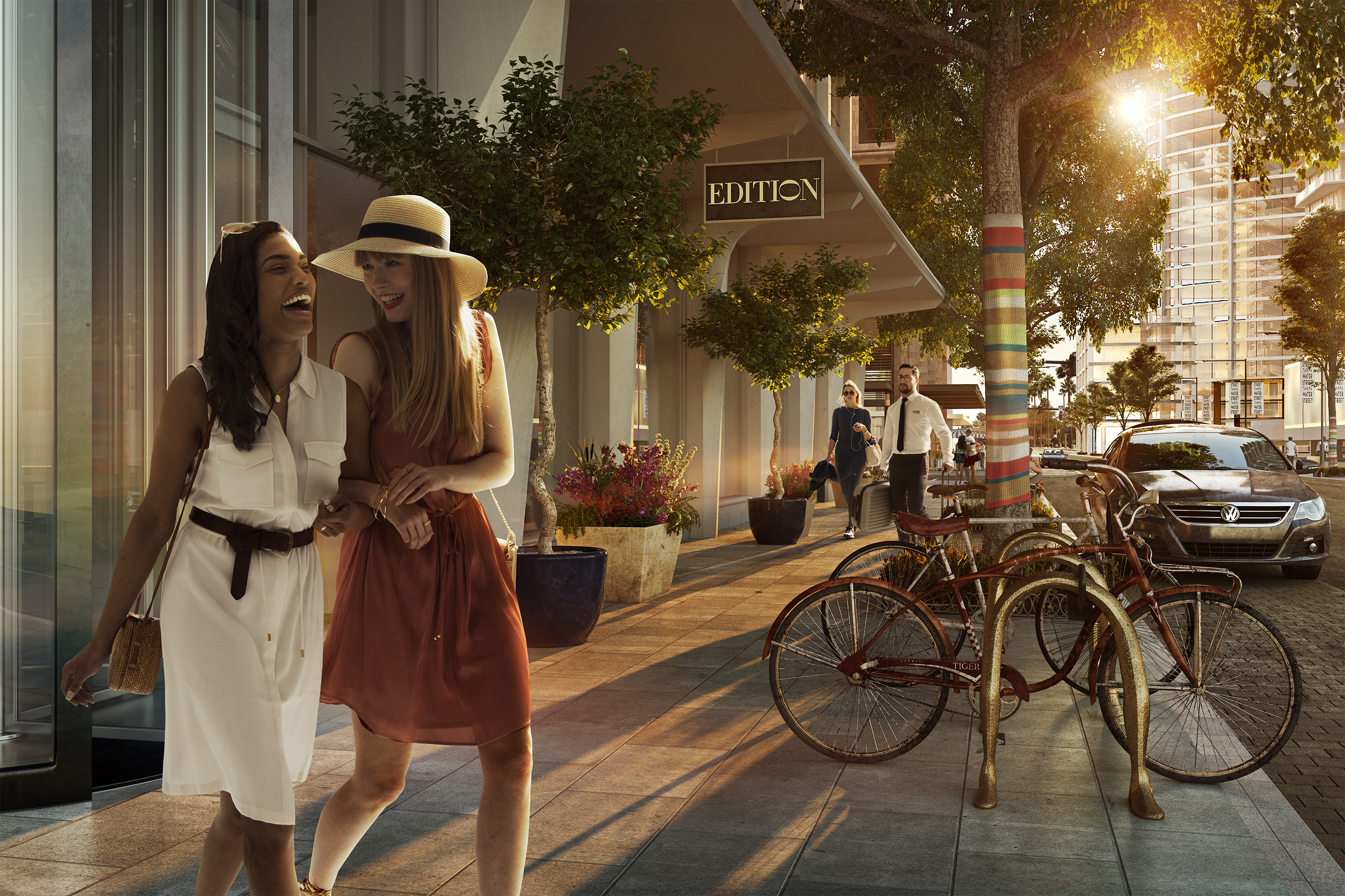
Take a look at these two images – they both illustrate essentially the same things. Two ladies walk arm in arm. There’s public art behind them. However, one is way more emotive than the other. One is essentially just architectural visualisation, the other sells the lifestyle. Explanatory versus emotive.
click to view full render
click to view full render
Tell a story, celebrate a lifestyle, throw in a little joy! K11 Guangzhou vs Water Street, Tampa.
Why the historic lack of creativity?
Let’s take a little look at why, historically, there’s been a general lack of creativity in CGI renderings – beyond the fact that they’ve effectively been repurposed from architectural visualisation into sales tools.
No solid idea behind the brand.
For years, a logo, font and colour palette have been dressed up as, “The Brand” or “The Creative”. It is only recently that design and branding agencies in real estate have actually started to think and act like creative agencies. A logo is an expression of a brand, not the brand itself.
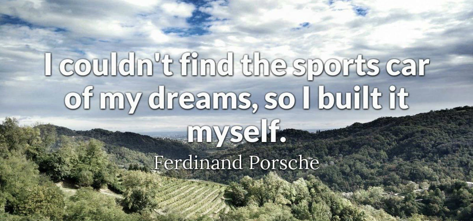
Love it or hate it Porsche has an incredibly strong brand because it has the so-called “Porsche Principle” as the idea behind it. The logo is NOT the brand…
click to view full render
The desire for a no-nonsense approach in CGI renderings
There are two things at play here: firstly, clients or agents/brokers just want to keep it simple and show the building – make it look nice, show the areas they want to show and that’s that. Secondly, doing something creative is often just put in the “too hard basket” – simply too much effort. It could be that the right thing to do is indeed just show the building and not worry about some kind of highly evolved concept, but we should at least go through some kind of basic creative process just to make sure that is indeed the way to go. It should never be the default position.

Viene subiendo: sometimes simply showing the building is absolutely the right way to go – but how you do that still needs to be carefully considered. Atrio, Bogota.
A lack of creative ambition within your CGI renderings
When we first started producing CGI renderings back in 2010, the “creative” conversation was limited to the likes of, “Should he [and it was always a he] be wearing a pinstripe suit or maybe, just maybe, a dark blue suit…?” Or, “He can be on his Blackberry! Or maybe even an iPhone!”. Unfortunately, all too often creative conversations fail to move on much beyond this kind of banality even today. Let’s try harder!

Character or caricature…?
I don’t like it!
If you don’t have a solid idea behind a CGI rendering, comments can so easily become entirely subjective because there’s no creative structure to adhere to. We’ve banned the word, “like” from the studio and try to make sure conversations revolve around what is or isn’t successful – and why. Having a proper idea makes the entire team focus on what is and (often more importantly) what isn’t important.
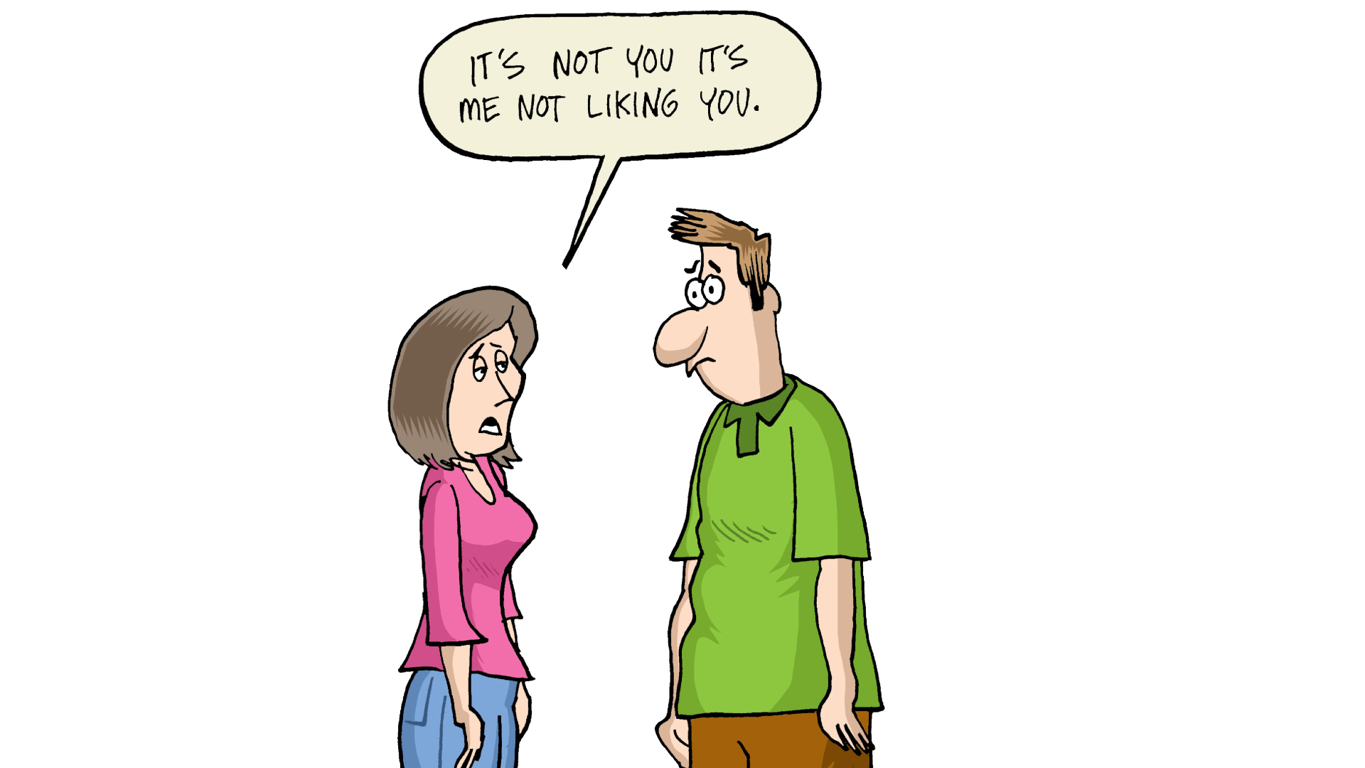
A solid idea helps the team remain objective.
Too many cooks…
What’s a camel? A horse designed by committee… You might start with a great idea, but if you have too many cooks you’ll have too many opinions. We’ve all experienced this and we all know that it’s a bad idea – and yet the obsession with ensuring “ALL stakeholders” have a say means that it happens all the time. One way to avoid this is to kick off projects properly to ensure that everyone is aligned and give people plenty of opportunity to give their input before the work is done, but much less chance to give their feedback.
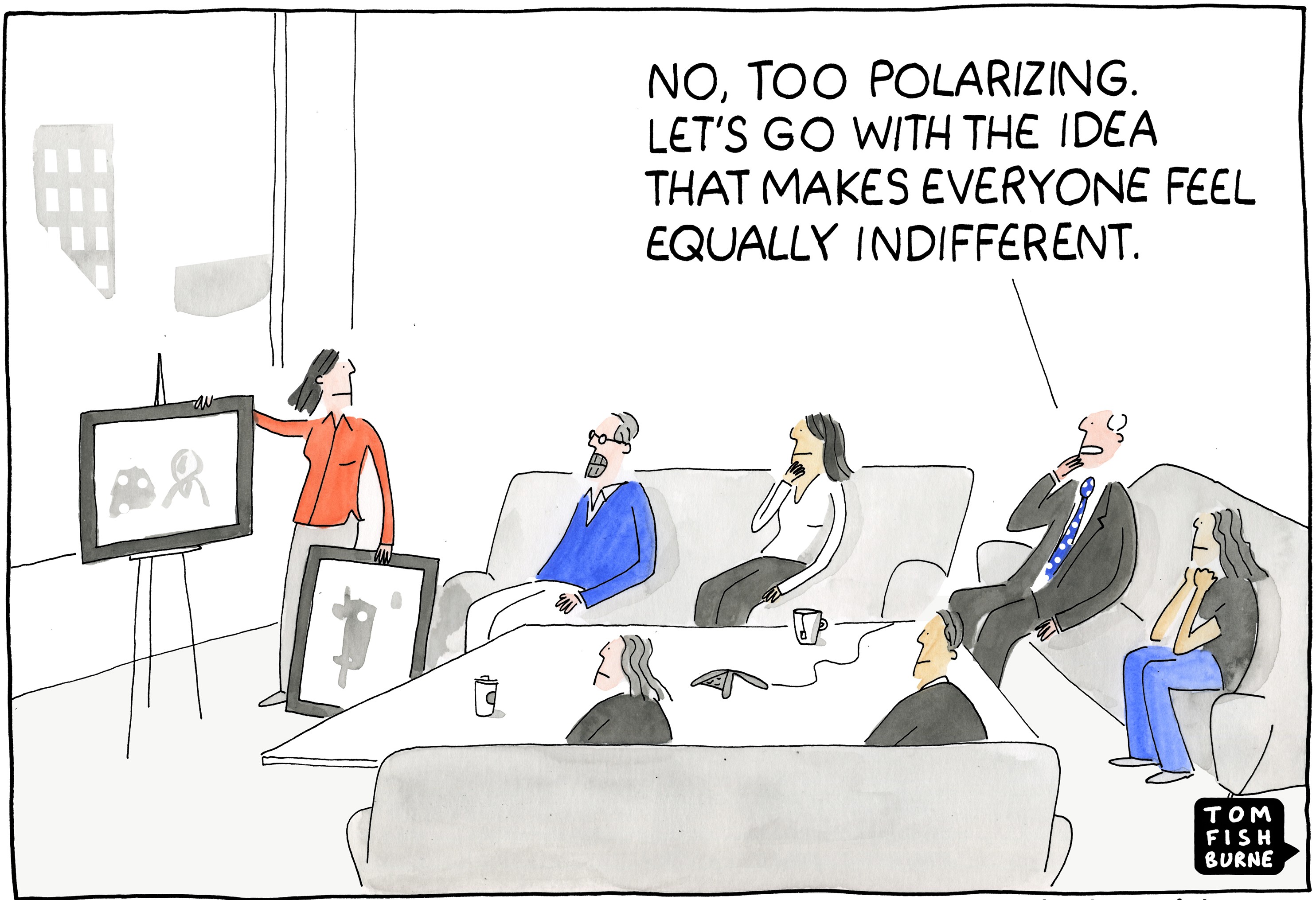
When you have too many cooks, very often the inevitable committee will chip away at an idea until all that’s left is bland mediocrity.
Trying to do too much with your CGI Renderings
This is a huge problem. You want to see all four walls, the period features in the ceiling, all eight sides of the octagonal desk – and the view… If you have a decent idea behind the image you are much more likely to be able to create a proper hierarchy too. We’ve even been asked to, “make the glass more transparent… and reflective!”. Now that really is a challenge. Be a great client, get great work – focus on what’s really important.
There are plenty of other reasons why CGI renderings can often be lacking in creativity, such as fear or underestimation of the audience, but we find that clients increasingly recognise the need to produce evermore emotive imagery and so are willing to engage in the creative process.
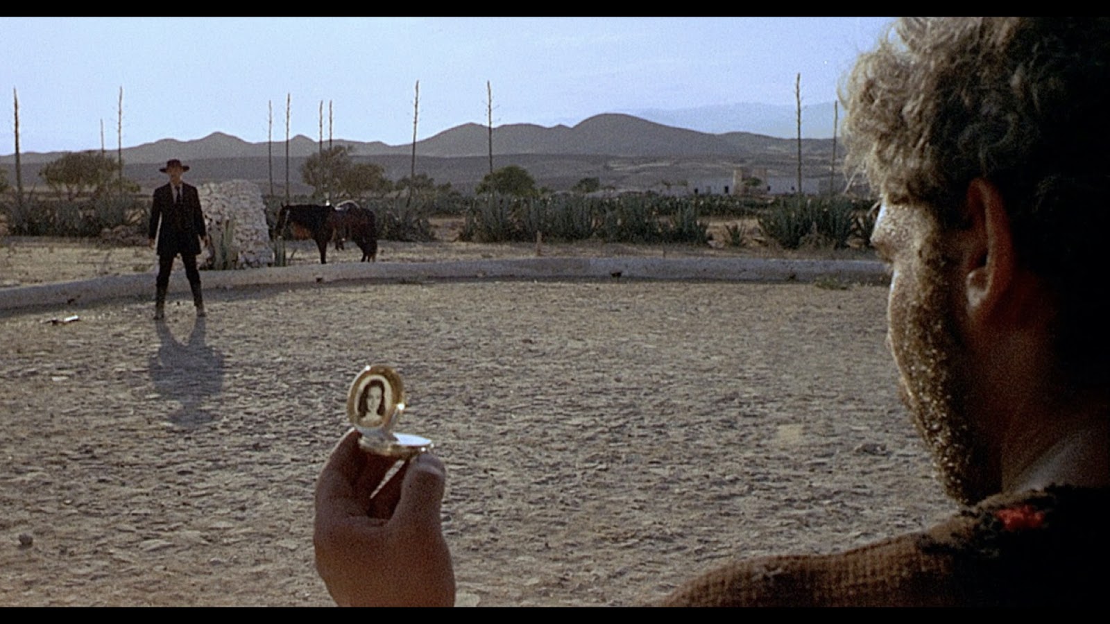
If we can create imagery with as strong a hierarchy as Sergio Leone, we’ll be winning.
